Tone Home
Modern Luxury Interiors | October 2013
Key Largo: A couple’s second residence is a testament to minimalism—tropical style
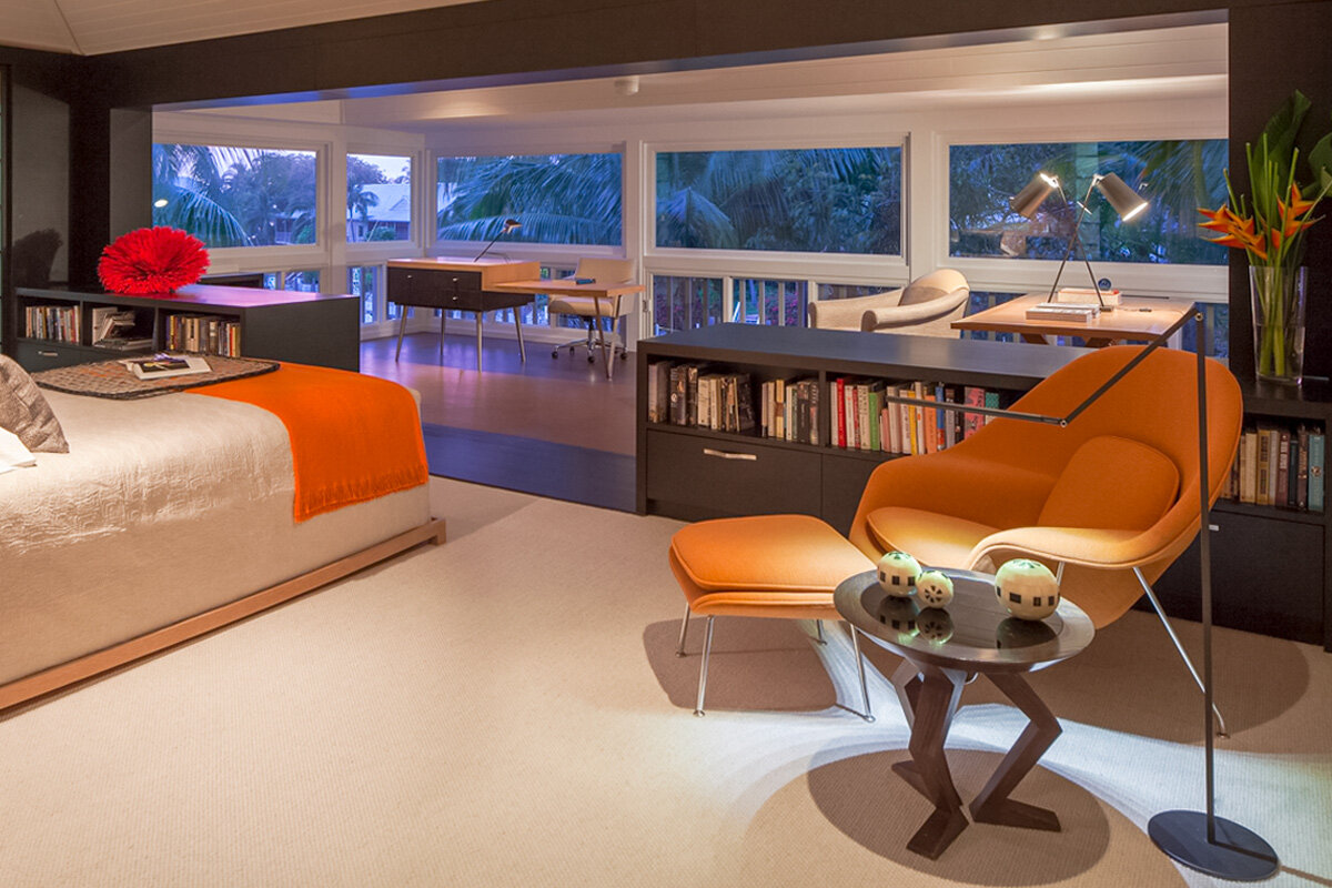
Resting on canal side acreage that was once a fishing camp in the 1920s, this two-story Key Largo house on stilts has an exterior that speaks of Old Florida charm, with wrap around porches and a tin roof. But what’s behind the facade is exactly what distinguishes it from other residences in this Card Sound enclave. The minimalist palette within is brushed with pale wood tones, coupled with occasional pops of cerulean blue and sunset hues. In fact, a classic Eero Saarinen womb chair in the master bedroom is dressed fittingly in vibrant citrus orange. Its companion is a low Gepetto table with tapered solid ash legs from Brueton. These pieces, among the other furnishings, instill a sense of Asian-inflected minimalism injected with midcentury modern ease.
“The landscape is so vibrant, lively and colorful here that we wanted a calmer, more tranquil interior,” says one homeowner, who also resides in a stone arts and crafts barn-style home in the Hudson River Valley with her husband. This contrasting lifestyle suits the snowbird pair, who spends six months of the year in this three-bedroom home on the northernmost tip of Key Largo. They’ve been following this schedule every year since 1999.
Their embrace of minimalism occurred shortly after they purchased the nearly 3,000-square-foot dwelling; it was then that Michael Wolk Design Associates entered the scene. The homeowners hired Wolk for limited changes, based on his “personalized design style.” The home’s interior is duly made-to-order. “Initially we did a couple of built-ins, lighting, floorings and furnishings. It was cosmetic,” recalls Michael Wolk, chairman and creative director of his eponymously named Miami-based interior design firm. Wolk knows of what he speaks when it comes to furniture; his custom pieces are found throughout.
On the first floor, in the living room, his stunning oak and glass-topped cocktail table is a focal point between two Warren Platner lounge chairs by Knoll and a contemporary armless sofa, the Hugo, by Terry Hunziker from David Sutherland. It’s wrapped in a timeless Knoll Luxe textile. “The fabric is beautiful,” the wife exclaims. Chairs of Wolk’s own design accompany the dining table, which was fashioned from light oak. The game table’s lines typify Wolk’s defining touch as well.
Inspiration for his furniture selections often derives from organic forms. In this home, rift-cut oak permeates and fills the space with mellow hues. “Rift-cut oak patterns are not distracting,” says Wolk. “Your eye follows the shape of the furniture, rather than cathedrals and burls in the wood. It’s more subtle,” he adds. There was no question that Wolk’s services would be utilized a second time around, when the homeowners decided to do some major upgrades last year. The duo chose to refinish or revise many of the pieces from the 1999 project. “We used a combination of elements from the first design and also reupholstered existing pieces or created brand-new ones,” Wolk notes. When the architect of record, Miami’s Robert Wade, was brought in to collaborate with Wolk to enlarge the master suite, the intent was to accentuate the ease and lightness of South Florida living.
Decisions included eliminating an atrium space where one could look down from the bedroom to the first floor, remove doors and enclose what had been a second-story screened-in porch. Once transformed, the suite became the location for Wolk’s one-off dual height desk paired with a swivel chair from Tuohy Furniture. “We worked hard on the desk,” says the wife, laughing. “I especially wanted flexibility, something I could both stand up and work at, and sit down at. This is what Michael came up with. It’s so clever, with its lower and higher planes,” she says.
“Their lifestyle called for a more open space to appreciate the waterway as they looked out at the bay at Card Sound from the master suite and the lower level,” Wade says. The stilts helped: “The dwelling is set about 8 or 9 feet above ground on the first level, while it is about 16 feet up on the second.” The bed’s eye catching light oak headboard with built-in storage was custom-designed, and the altered space plan gives the piece a new point of view. “We were able to float it in the center of the master bedroom, facing the water,” Wolk says. The husband enthuses about the change: “Now the bed has a big enough space to float in a lofty room. We picked up a lot of square footage, and it’s everything we wanted it to be.”
Wolk’s penchant for wood is especially prominent in a signature touch: the walnut threshold banding that widely frames the entryway to the gutted and redesigned bathroom. The passage confers a calmness, a feeling of stepping into a sanctuary. “The threshold creates an opening to the space without limiting it with doors,” Wolk observes. Indeed, the home reflects a minimum of conventional barriers. Pass through this portal, and the wall is divvied up between haisa light marble and Venetian plaster for a wainscoting effect. In the shower, the vein-cut polished and honed marble goes full up to the ceiling.
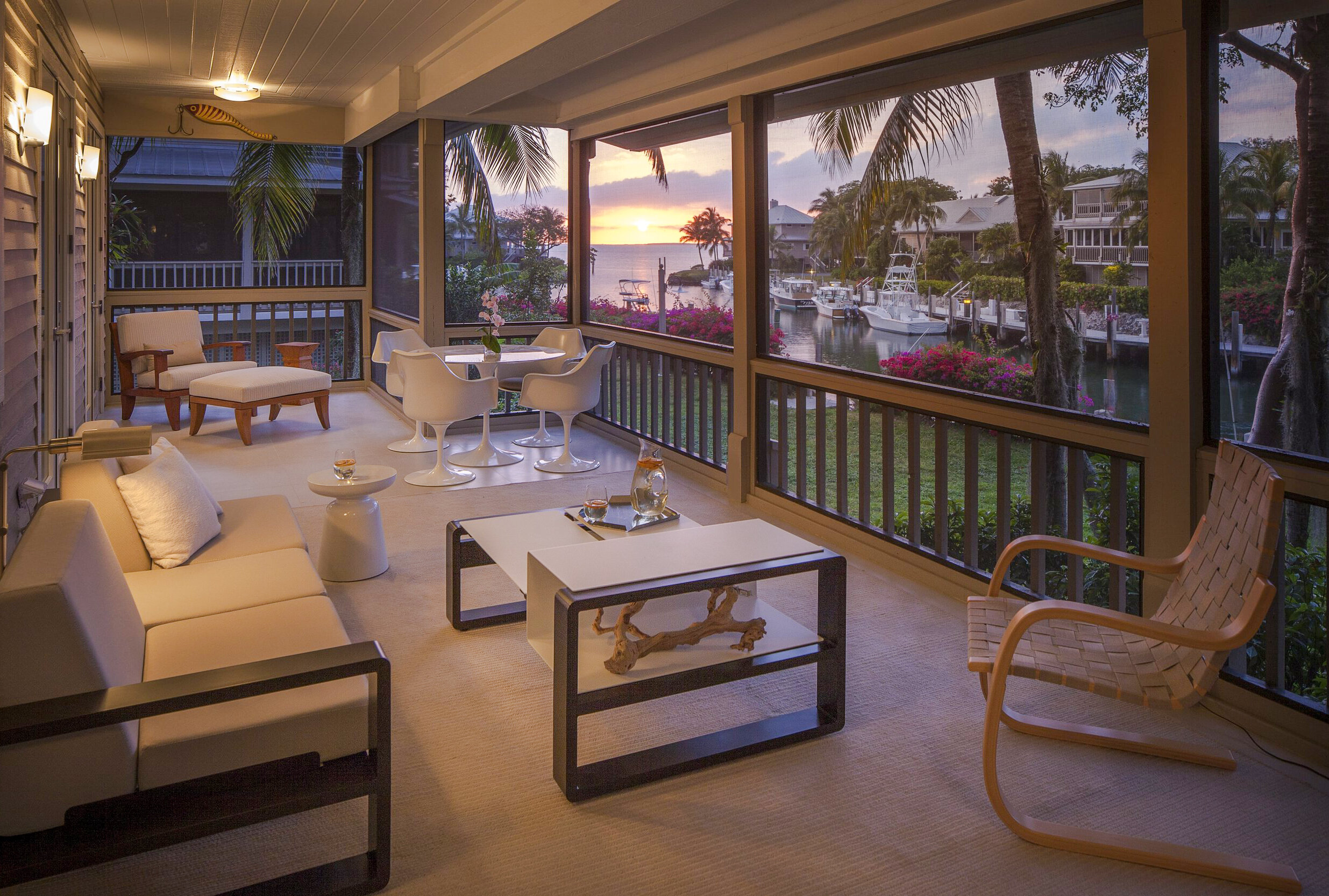
Perhaps the ultimate representation of Florida living is the ground-level porch. It is the homeowners’ safe harbor, their spot for getting away from it all. The Eero Saarinen table and Tulip chairs make a strong statement; the neutral, simple sectional from Clima Outdoor anchors the opposite wall. For this couple, their winter retreat is about appreciating the sunset, coupled with catching seasonal balmy breezes.
To maximize that enjoyment, further boundaries were eliminated: “We took the glass out and replaced it with screening,” the wife explains. “The living room’s French doors open onto the porch. My husband wanted to be surrounded by fresh air.”
By Susan Friedman | Photography by Michael Stavaridis


