View Finder
Luxe | October 2012
there was never any question that the house was situated on a beautiful lot: with a lake flowing through the verdant property, it is close to the water and Invigorated by a prevailing southeastern breeze
But the long modernist house, originally built in the 1960s, a 6 loot high wall that obscured any possible views. Architect Bobby Altman took one look at that Mies van der Rohe-esque element and knew it had to come down. “My feeling." he says, "was that the house simply wasn’t aware of what a beautiful lot it was on."Altman devised a plan to update the space, expose it to light and. with the keen eye of interior designer Michael Wolk, create a sophisticated and vibrant interior that would complement the enchanting exterior.
The only foreseeable hurdle was time; the homeowners were relocating from outside the country, and the project needed to be completed fast—seven months fast. Along with the schedule crunch, the clients also had some cherished furniture pieces that they just couldn’t part with, including a sinuous wooden chaise, a metal-and-glass coffee table and a large glass-topped dining table whose length wouldn’t fit in the house.
The solution? Make more room by knocking out the end of the dining room and lengthen the space with a glass-and-steel-beam extension that accommodates the table and, with that claustrophobic exterior wall gone, offers views of the lake past the canopy of an old oak. Plus, “it increased light in the room twofold,” says Wolk.
Where an overhead skylight spills sun along the hall, the existing wood floor was lightened The pair of chairs, inspired by the iconic Barcelona design, and the barstools are a few of the clients* own pieces that were incorporated into the design.
On the second-story deck that runs the length of the house, a seating area with furniture from Design Within Reach and a Paola Lenti carpet is partly shaded by an oak during the day. At night, inconspicuous lighting installed high in the branches casts a moonlight effect
In general, explains Altman, "the house had good bones, but it was deficient in windows and glass doors." So while Wolk and his team—project manager Giselle Coujil and senior designer Kelly Watson—consulted with the clients on interior finishes and décor selections, Altman added all new windows and replaced existing ones. They also gutted the master bath, installed terrazzo flooring, replaced dark metal-mesh railings on the deck with glass, and opened up the entries closed balustrade, exposing a white concrete sawtooth stair with a low-iron glass railing that contractor Jeff Vineberg says "doesn’t have that typical green tint.” Adds Altman, “We made it more South American modernist. It’s warmer, has more texture, more color, and a tropical sensibility.”
A column wrapped in coral mosaics highlight the pool, by Tuttles Pool Company, and concrete-paver patio, where chairs from Janus et Cie with bright orange cushions face plantings of bougainvillea.
A strategic placement o' Bocci ceiling lights from Luminaire on a dark painted ceiling convey a sky-like scene adjacent to the airy glass-and-steel extension designed by architect Bobby Altman. The addition was made to accommodate the clients beloved extra-long glass-lopped dining table.
Wolk's interiors echo the architectural aesthetic achieved by Altman. Some parts of South America, he says, “have a capacity for vibrancy, and these clients love color.” So while a palette of pale neutrals plays off dark wood casings and detailing, the bright artwork and accessories peppered throughout pop. Upstairs, the master bedroom glows in a golden yellow; outside on the pool deck, a column is wrapped in a coral-and-orange mosaic. On the ground floor in the lake-facing family room, a burnt orange rug by Rosemary Hallgarten sets the tone in the same color value as the clients' wood chaise, while fuchsia pillows on an ivory Flexform sofa from Luminaire hit a deeper range. A furniture designer by training. Wolk incorporated a few of his own neutral pieces, such as upholstered armchairs. “They add distinction,” he says.
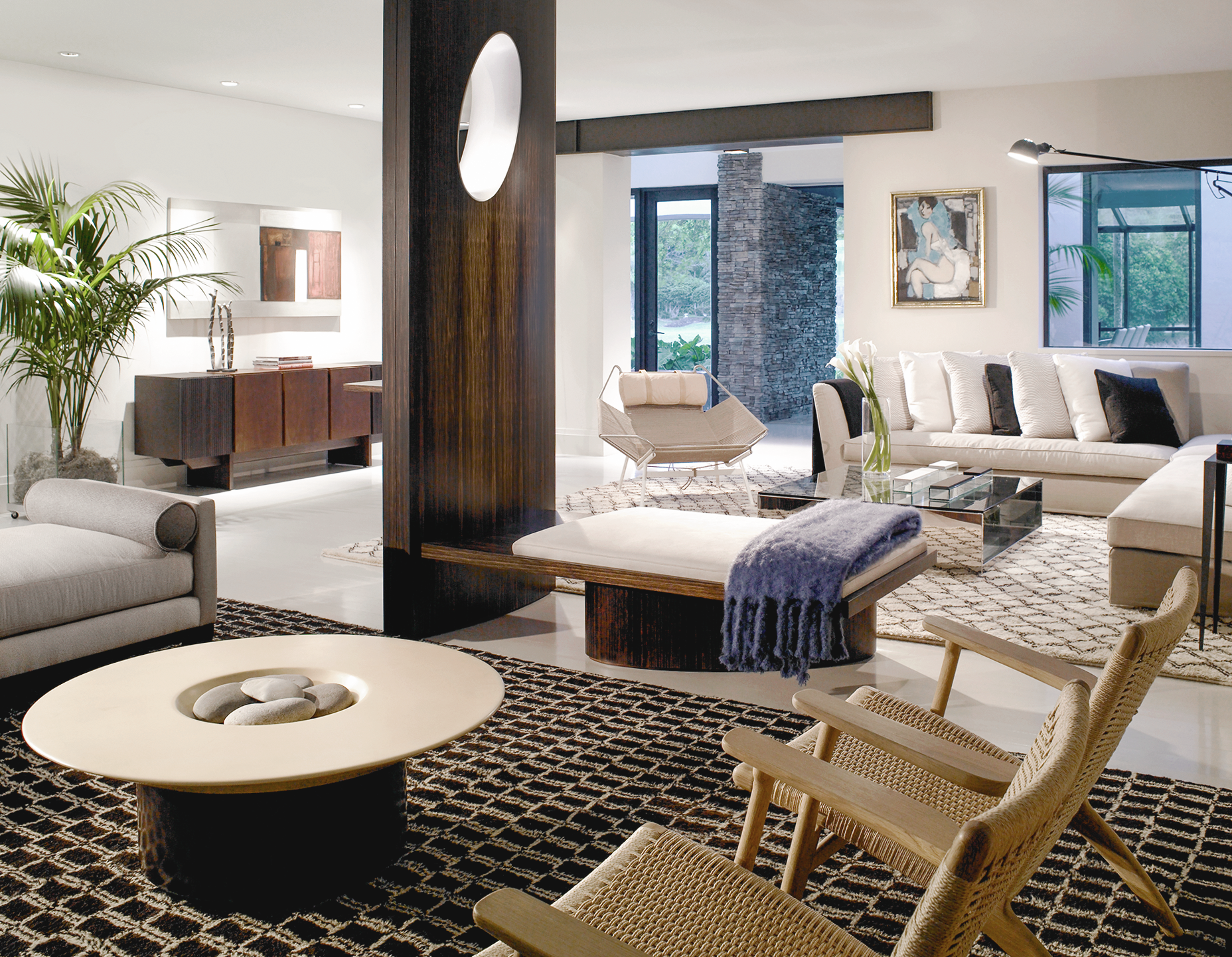
The house had undergone renovations in the past, and one odd scar from these alterations remained in the living area an exposed (and rather prominently featured) weight-bearing column in the middle of the room. Wolk took the opportunity to transform the blemish into a sculptural highlight with a function. He designed a wood wing wall, stained dark like the room s other casings, to fit over the pole, while a cantilevered portion at the bottom serves as a bench, delineating one side of a seating area. “It gave an anchor to the room,” says Wolk. Perforated with a center oval, it has a decorative element that also encourages flow.
INTERIOR DESIGN: Michael Wolk Design
ARCHITECTURE: Bobby Allman. Allman Architects, Inc.
HOME BUILDER: Jeff Vineberg. Mastercraft Group, Inc
LANDSCAPE ARCHITECTURE: John Farrar. The Articulate Garden. Inc
BEDROOMS 6 BATHROOMS 8 SQUARE FEET 8.000
By LIZ ARNOLD | Photography TROY CAMPBELL


